


Scope of Work
Identity Design, Brand Visual Language, Brand Collateral
Signage and in-store graphics
Credits and Links
Interiors and Space : Sanya Desai and Bina Shah
Overview
Yash Charitable Trust (YCT) was founded by Sushma Nagarkar to assist people with developmental disabilities successfully transition into adulthood and become responsible, productive members of the communities that they live in. In 2017, the trust launched Arpan, an initiative that provided real community jobs to individuals with significant developmental disabilities. The core belief at YCT is that persons with autism and other disabilities have enormous strengths that can serve them well in an appropriate workplace. At Arpan, the team run a daily tiffin service, preparing delicious home cooked meals on a daily basis. From grocery shopping, to meal preparation, cooking and cleaning and delivery.
Although started as an experiment, Arpan was a success, and the team enjoyed every step of the process, particularly their interactions with customers. This proved immensely rewarding to the team and their families. Cafe Arpan was their way of taking this further. Crowd-funded through a online campaign, the trust acquired a space in January 2018, and worked towards building a cafe. From planning menus to training the team to interact with customers, YCT worked towards launching a cafe that would not only provide gainful employment to marginalised sections of society, but make the city more accepting and inclusive for all communities.

The Brand
The Identity - Celebrating Inclusion + Community + Healthy Living
When working on ideas on how to represent the brand visually, I knew it was important that it was cheerful and fun. All too often, disabilities and not-for-profit initiatives are shrouded in gloom, and after having met the energetic, friendly team at Arpan, I knew the identity needed to be warm and approachable.
The identity we decided best fit the cafe was a hand lettered wordmark. The letterforms are imperfect and with a little quirk and play represent the spirit of Arpan- bringing people together and celebrating their differences. The two lowercase ‘a’s in the name that are different from one another help reinforce this idea.

Brand Visual Language
Along with the logo, we built on the story of the brand with a stamp-like device that could be used together with it. Housing three words that best represent the trust - Inclusion, Acceptance and Empowerment, this unit gave us the opportunity to talk about the brand and what it stood for.
This came together with a brand colour palette that is cheerful and vibrant, and reflects the spirit of the cafe and the food- natural and healthy.
A collection of hand drawn illustrations completed the brand’s visual language, and allowed us to add character and play to brand collateral, from menus to packaging. These simple line drawings helped tell the brand story of natural and healthy food and reflected the positive, joyful personality of the brand. Across in-store collateral, the logo, colour palette and illustrations came together to represent a brand that is vibrant and fun - a cafe that is instantly noticeable and recalled easily.

The logo, stamp and illustrations used together on paper cups for Cafe Arpan
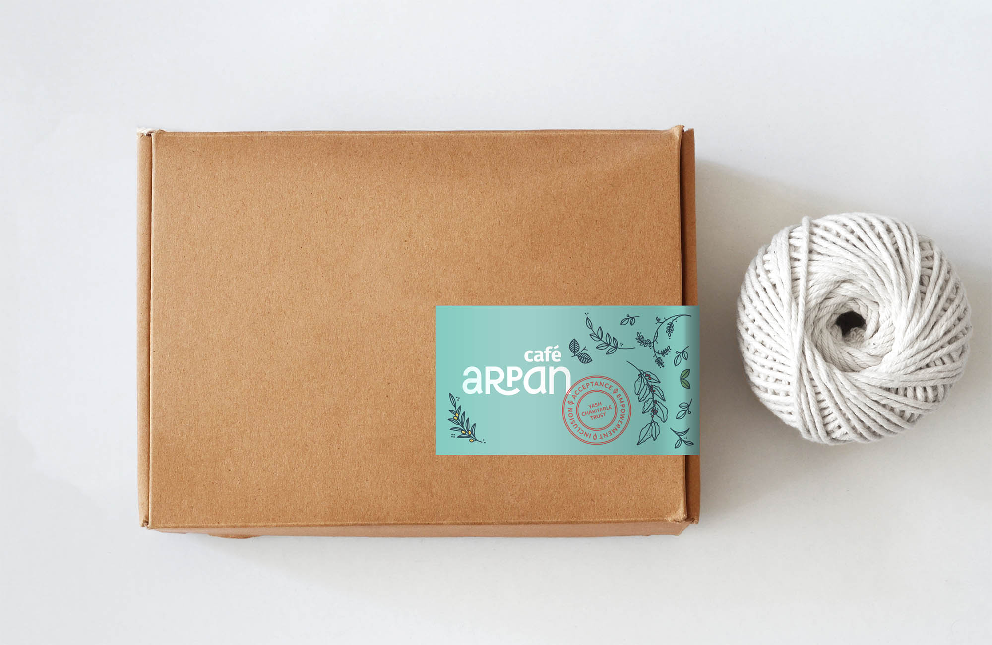
Since the Cafe was crowdfunded, we needed to work with low-cost packaging options. The simplest for the team was to use stickers to seal simple kraft paper boxes and bags.

Making the cafe easy and fun to run..
At every step of the way, the team at YCT worked to make sure their employees would not only be able to serve customers with ease, but would also enjoy the process. Simple solutions like numbered items on the menu ensured that even those who struggled with writing wouldn't have a problem taking down orders. We also introduced a Cafe Arpan stamp to use on bills- a playful addition that would be fun for the team.


We made simple stamps to use on bills and even on packaging- an activity that was fun for the team


The sign for the washroom door - simple line drawings consistent with the illustration style

A message on the cafe facade, introducing customers to the cafe and what it's all about
In July 2018, Cafe Arpan opened to the public and has been received huge tons of support from the media and the public alike. Going by constant updates on their social media pages, the team is happy and working hard, and the atmosphere at Cafe Arpan is filled with positivity and warmth.
Arpan in the Media
In the Hindustan Times on 2 August 2018
In the Bombay Mid Day on 4 August 2018
In The Deccan Chronicle on 5 August 2018
In ANI News on 5 August 2018
In The Bloomberg Quint on 16 August 2018

You can support Yash Charitable Trust and contribute to the running of the cafe here