


Koo
Commissioned by Bombinate Technologies
April 2021
Launched - 13 May 2021
Scope of Work
Identity Design, Brand Refresh
Links
The Koo logo launch was covered by leading publications across the country:
Mint, Exchange4Media, BusinessWorld, HT Tech and the Times of India
Overview
In April 2021, I was approached to re-design the identity for Koo, and Indian micro-blogging platform. The previous identity, a yellow bird, had grown to be associated with the platform and was distinct and recognisable. The challenge, therefore, was to retain the bird and the visual essence of the brand. The refreshed logo needed to look friendly and approachable, while continuing to be one Indians across the country could effortlessly connect with.


The revised mnemonic was crafted with keen attention to detail and simplified forms that would translate with perfect clarity across brand applications from ‘Share’ buttons to the app icon.
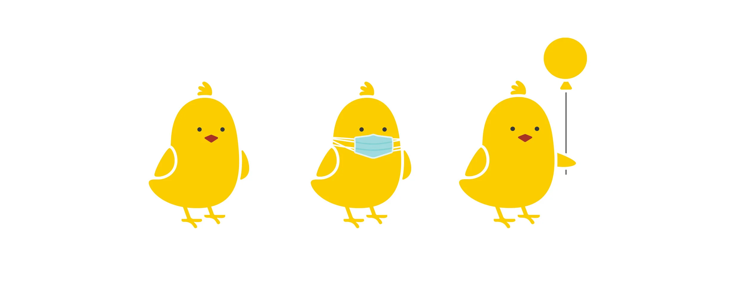
The Koo mnemonic in various avatars, including a masked bird to spread awareness of safe practices during the Covid19 pandemic

The identity, before (left) and after (right)


