


811 by Kotak Mahindra Bank
Commissioned by Kotak Mahindra Bank
January 2017
Launched - 29 March 2017
Scope of Work
User Interface Design, Icon Design
Credits and Links
Available for download on Google Play and The App Store
811 Identity Designed by Cartwheel Creative Consultancy
Developed by Market Simplified
Overview
After the demonetisation of Rs. 500 and Rs. 1000 currency notes in November 2016, the Indian government's first step towards a digital economy, Kotak Mahindra Bank responded to a problem prevalent in India- Indians who do not have bank accounts, or easy access to a physical bank branch. 811, by Kotak Mahindra Bank allows customers to open a bank account through an app in under five minutes, without needing to visit a branch. 811, which is an addition to the existing Kotak Bank app, takes new users through a simple step-by-step process, at the end of which they have everything they need to transact securely.

Designing the User Interface
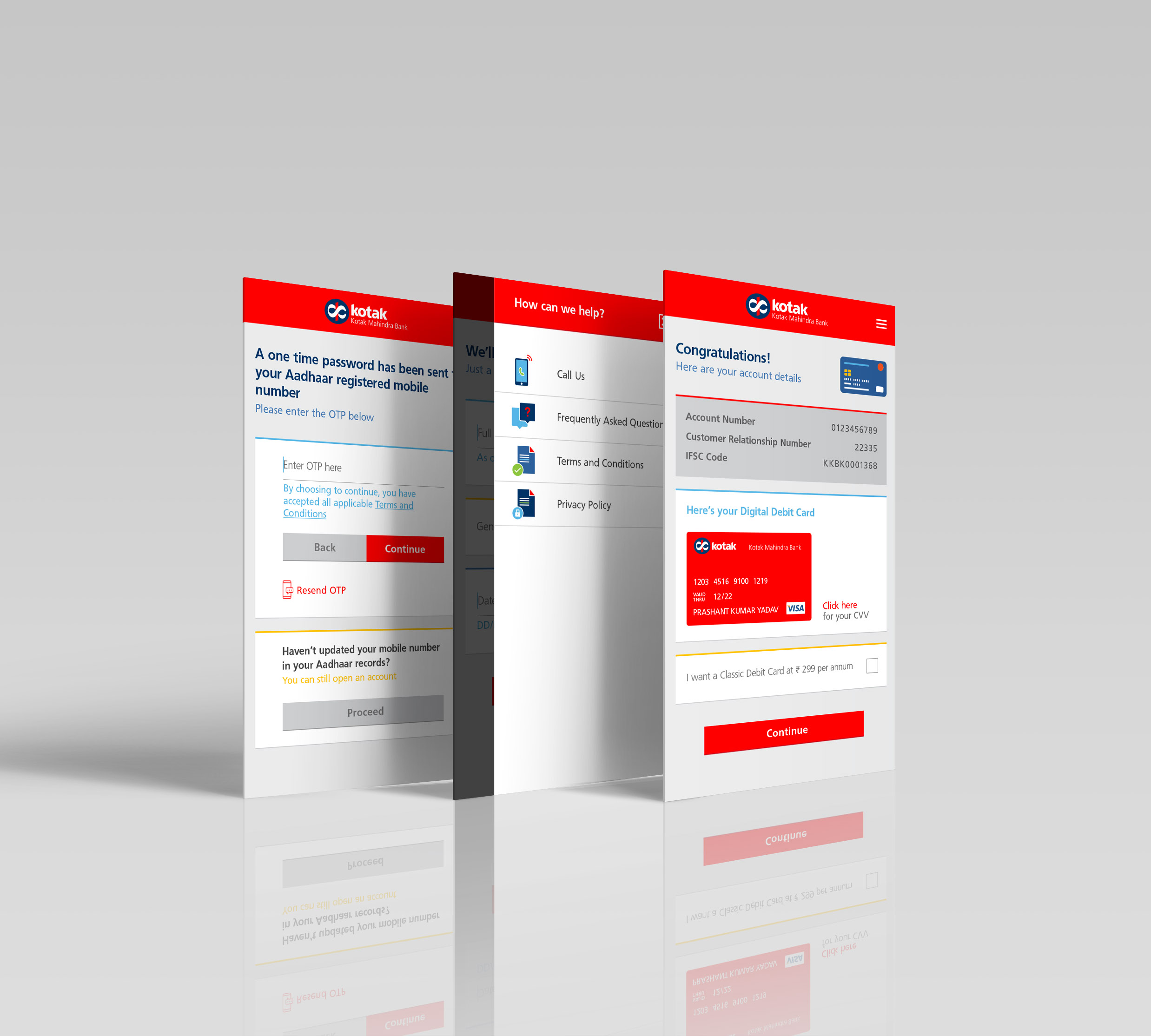
Since Kotak Mahindra Bank already had defined colour and typography styles in place, I was called upon to work within the existing visual framework and design a user interface that was simple and clean but also approachable, friendly and not cold and sterile like financial apps are often perceived to be.
Strictly adhering to the brand guidelines, I designed an interface that was cheerful and bright, and yet effortless to navigate.
A red navigation bar holds the logo as well as a burger menu on the top. Below, content is split into individual blocks so as never to overwhelm or confuse the user. Brightly coloured icons support the text, adding context to each screen and red call-to-action buttons are impossible to miss.

Iconography
The existing Kotak Bank app uses dual coloured icons in grey and red. Since I had been requested to make the interface brighter and more cheerful, I designed a set of icons that were unique to the brand.
I designed flat, simple icons that would effectively aid text. Taking cues from the Kotak corporate identity, each of the icons has accents of red, cuts separating individual components, or circular forms. I worked with Kotak's secondary colour palette so that the icons brightened up each screen, making the process of filling out forms and opening an account more enjoyable.

The Success of the App

When 811 was launched in March 2017, the company’s goal was to double their customer base from 8 million to 16 million in 18-24 months. Within the first six months of the launch, over 2.5 million customers were added, and by December 2017, the bank had more than 12 million customers. An article in the Financial Express reported:
811 — touted to be the first-of-its-kind digital bank — had helped the mid-sized lender take its deposit base to 10.5 million from 8 million within the first six months of the launch. Kotak had said in March that as of December 2017, the bank added 50% of the target and was in excess of 12 million accounts, adding that, on a monthly basis, the bank was adding customers at a rate 2.5-3 times higher than it did a year ago.
In September 2018, the number reached 14.5 million, as reported in Express Computer:
The bank is also close to doubling its customer base – in March 2017, the bank had estimated that it would double its customer base from eight million to 16 million by September 2018. In the quarter ended June 2018, the customer base moved from eight million at the end of March 2017 to 14.5 million.
Additionally, 811 won the Bronze Award in the Mobile App category at the 2017 SmartiesTM Asia Pacific awards held in Singapore, instituted by the Mobile Marketing Association.