


Rheson
Commissioned by Shoppers Stop Pvt. Ltd.
2015, 2016
Launched in May 2017
Scope of Work
Identity Design, Brand Visual Language, Brand Collateral
Concepts and Art Direction for the Prints for the first season
Credits and Links
Conceptualised with Rhea and Sonam Kapoor for Rheson
Illustrated by Arushi Kathuria
Available at Shoppers Stop stores nationwide
Rheson on Instagram
Overview
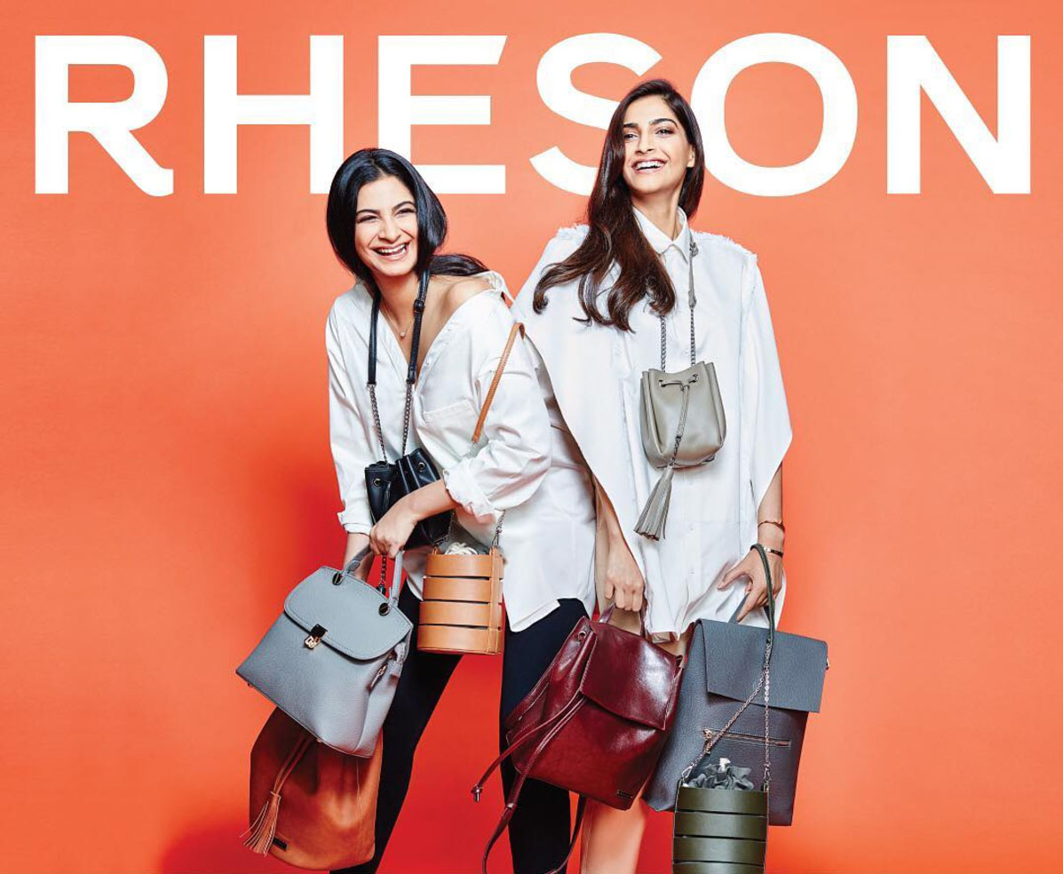
Sonam Kapoor and her sister, Rhea Kapoor have, for years now been considered style icons for young India. In early 2015, the duo approached me to design an identity for a new project that they were working on- a collaboration with Shoppers Stop to launch a high street fashion label.
Rheson (RHEa + SONam; pronounced 'reason') was conceptualised to be a brand for fashionable young Indian women, aiming to bring quality clothing and modern silhouettes together at an affordable price. Their partnership with Shoppers Stop meant that the brand would be sold at metros as well as smaller cities making the brand accessible to a large demographic. The first of it's kind, the brand aimed to position Indian retail on the global fashion map, building a homegrown brand at a scale never seen before.
I began working on the identity, and was then asked to work on the print concepts for Rheson's first collection. This led to a year long engagement in 2016 with Shoppers Stop and Rhea and Sonam, where I conceptualised and art-directed prints for Rheson clothing.
The Brand
Conceived and creatively directed by Sonam and Rhea Kapoor, Rheson is all about accessible glamour - aspirational, but never intimidating. An urban Indian girl’s reinterpretation of the global fashion scene, the brand focuses on quality fabrics and wearable styles.
When we began work on Rheson, it was important to articulate all that the brand was about- contemporary, witty and irreverent- one that doesn’t take itself too seriously. Sonam and Rhea wanted a brand of clothing that was strong, confident and playful and all about experimentation, designed to be styled in versatile ways, taking on the personality of the wearer. The identity needed to be equally flexible.
From the very beginning, I worked in black and white, giving the brand the flexibility to take on colour when it needed. For a brand that was going to be so prominent on digital media, one that demanded playful communication and campaigns, a rigid set of guidelines seemed counter intuitive. So we experimented with typography, debating how to spell 'Rheson' in a way that was easy to pronounce and worked well typographically. After rounds of iteration we settled on a bold, confident, sans-serif wordmark. Despite its simple lettering, the wordmark had character and personality that made it easily identifiable.
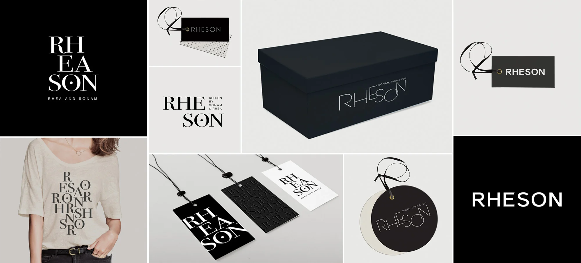
Experiments and play with the Rheson identity; debating the phonetics of 'Rhea-son' and 'Rhe-son'
The final identity on the bottom-right corner
The logo appeared on primary collateral in variations of white and shades of grey, standing out bold and confident, but never overpowering or clashing with prints on clothing. We took this simple brand language across brand collateral from hang tags to shoe boxes and shopping bags. On clothing tags, we highlighted the 'R' and 'S', adding a little play to the otherwise simple label.
Every single brand touchpoint was designed and detailed, from logos on buttons, zippers and the tiniest rivets and clasps, to dust bags for handbags and shoes. Prescribing logo sizes, colours, material and treatment, it was important that the Rheson branding be consistent when used on products since we encouraged play with it in communication. Since large logos and over-the-top branding was not a part of the Rheson brand personality, the key was to ensure that the logo was clearly visible, but subtle.
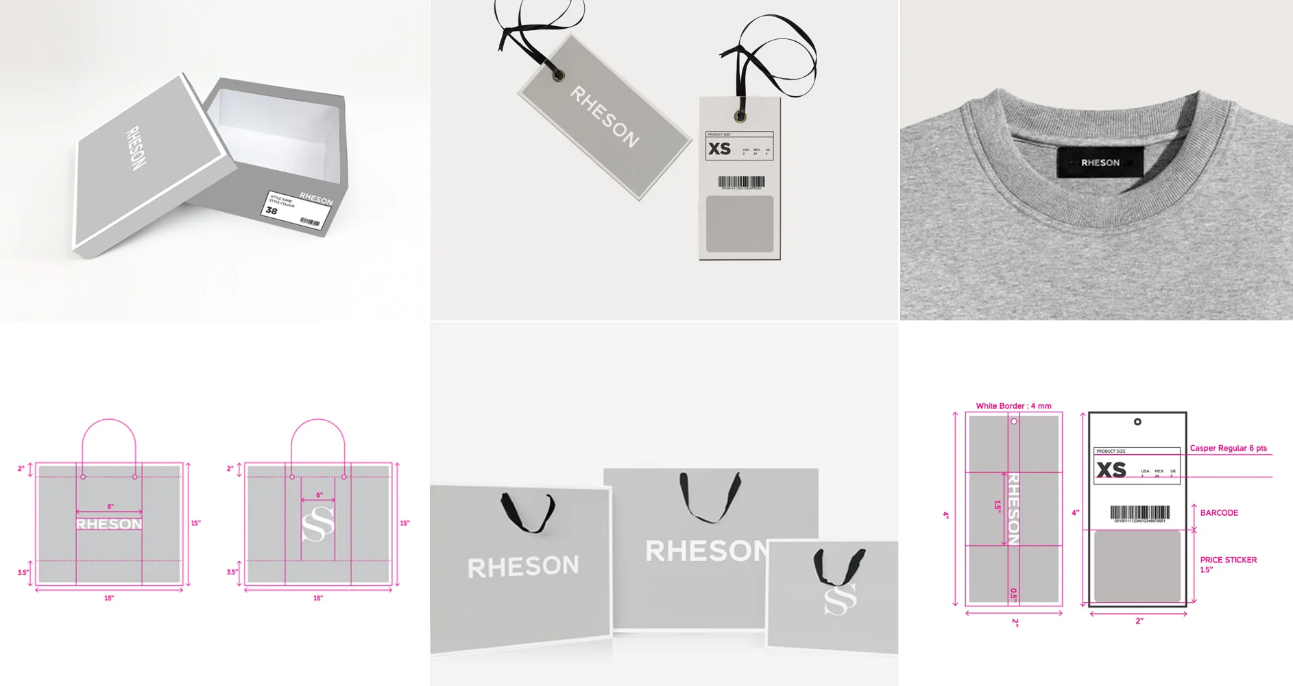
Working with the Rheson brand collateral- from shoe boxes, to bags
The images above were used as mocks in the early stages of design, and are representational only.
The Print Collections
When I was approached to work on the Rheson print collection, I felt completely out of my depth. Designing prints for fashion was not something I'd done before, and so I began with what came to me the easiest- Graphic t-shirts. Rhea and Sonam wanted to introduce a line of t-shirts and sweatshirts that were great quality, comfortable and had a little edge. Since we had talked about building a brand voice that was witty and a little quirky, I sat down to write. One of the problems I was hoping lines of text could solve, was that of pronunciation- would people get the brand name right? With a name like 'Rheson' it was hard to stay clear of the puns, and these wound up being printed.
(All but the punniest one that I secretly loved the most- The Age of Rheson)
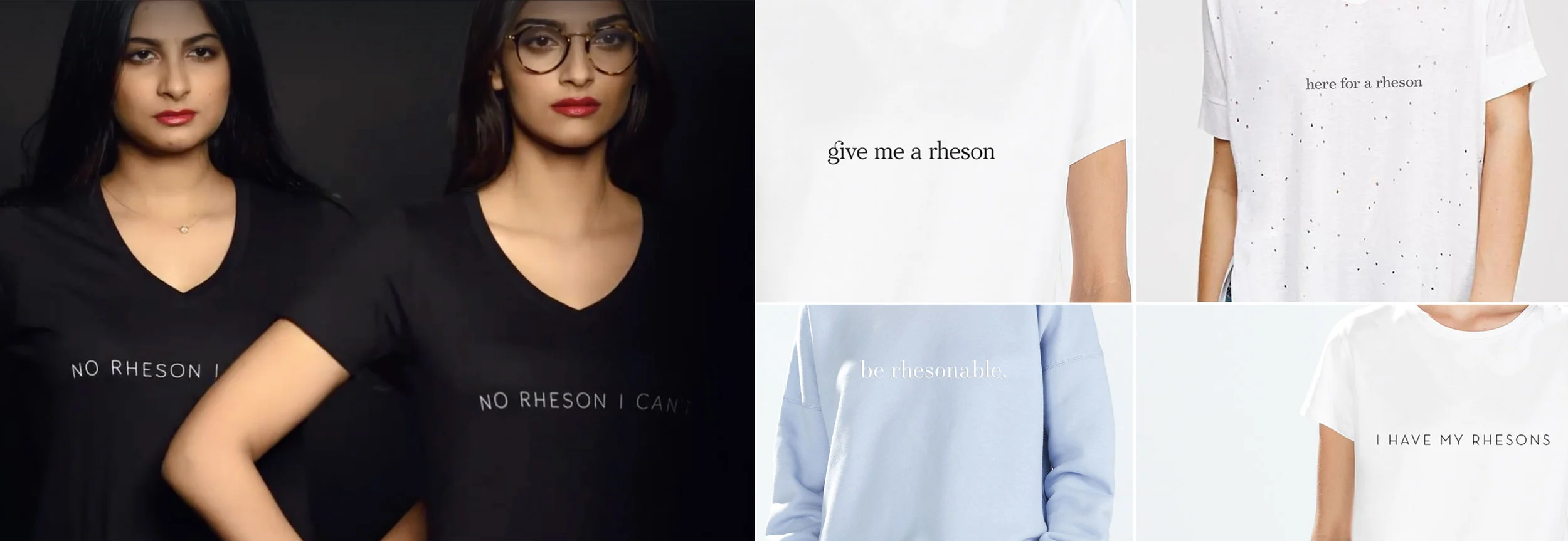
'No Rheson I Can't' went on to being the hashtag for the Rheson launch early in March 2017
The garments used in the images on the right are representational only- while the clothes don't belong to the Rheson collection, the quotes do
The Western Line
Each season was to have a mix of Western and Indo-Western silhouettes, and we needed prints that worked with them. Rheson was unapologetically Indian, but definitely not kitsch. It was important to find a balance that would lead to compelling, original prints. As we threw around ideas of things we loved that were unique to who were are as a country, the 90s came up frequently. It was our childhood- memories of school- packed bags, new, unspoiled erasers...and of course, the beautiful rings of shaving left behind in pursuit of the pointiest pencils.

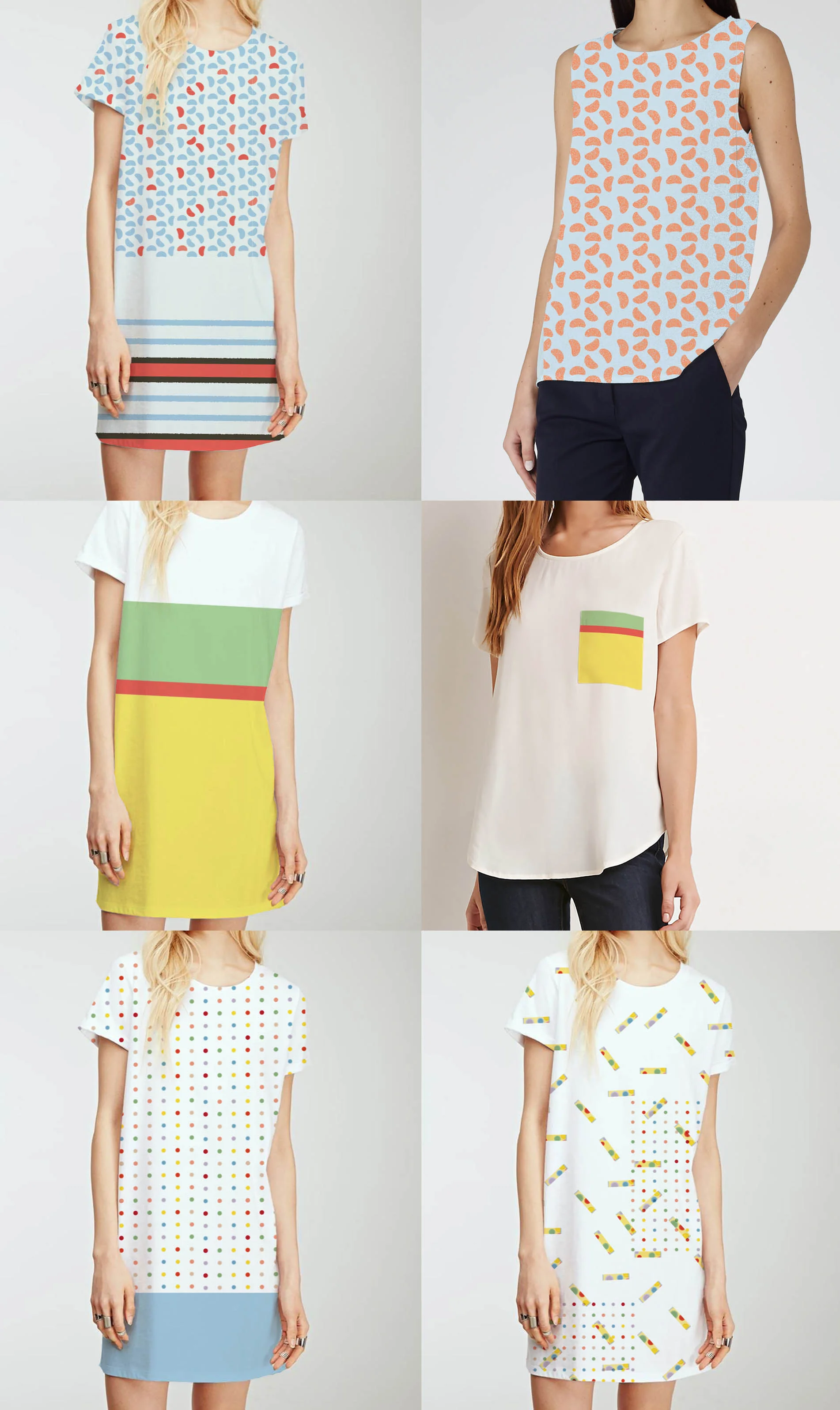
Early experiments with stationery prints
The garments used in the images above were used as mocks in the early stages of design, and are representational only. These are are not part of the Rheson collection.
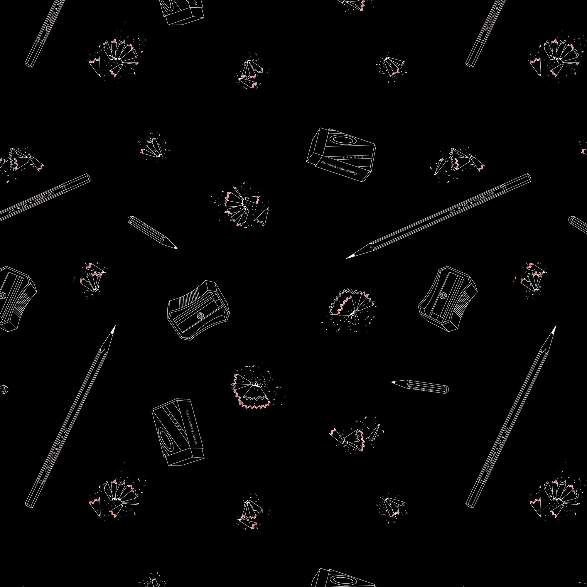
The final stationery print we worked with


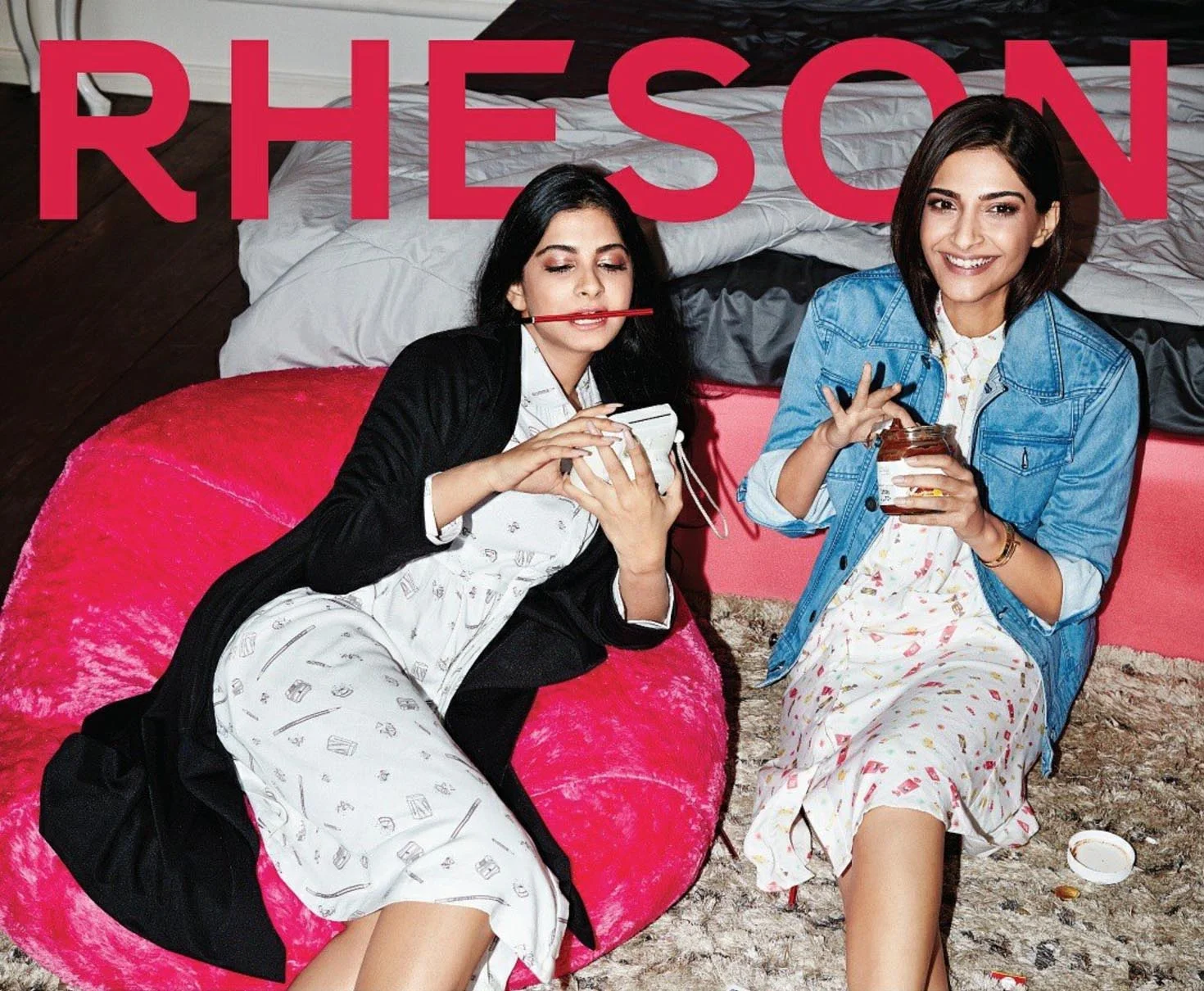
Rhea and Sonam in the Rheson Stationery Collection and Beloved Candies Collection
Campaign Designed by The Brewhouse
Shot by R Burman
Styled by Deep Kailey
The 90s inspiration continues..
Along with stationery, a huge part of growing up in India in the 90s, was the food- toffees and hard-boiled candies and colas and thick, syrupy mango drinks. We experimented to bring it all alive with a print collection that any child of the 90s would be able to relate to.

Early experiments with 90s nostalgia prints
The garments used in the images above were used as mocks in the early stages of design, and are representational only. These are are not part of the Rheson collection.
Experiments with candy
Abstractions of orange candies, Mango-bite and Poppins
The garments used in the images above were used as mocks in the early stages of design, and are representational only. These are are not part of the Rheson collection.
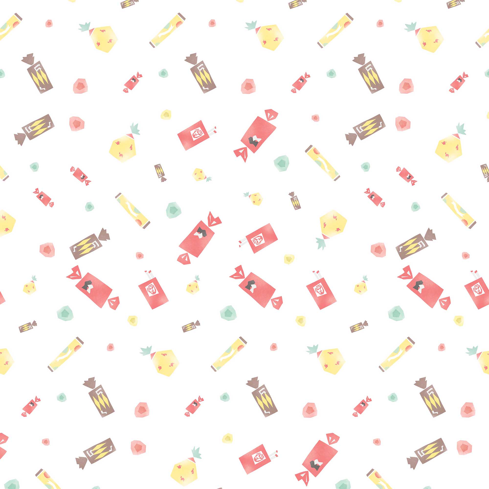
The Beloved Candies Collection- the final print we worked with

An extension of the Beloved Candies Collection- a print inspired by Phantom Sweet Cigarettes, a (wildly inappropriate) but wonderful part of growing up in the 90s in India
Campaign Designed by The Brewhouse
Shot by R Burman
Styled by Deep Kailey
The Indo-Western Line
Strikingly different from the western silhouettes-dresses, shirts and jackets, the Rheson indo-western line includes contemporary interpretations of Indian wear- tunics, straight pants and even playful stitched sarees. The idea was to create a line of garments that was easy to wear and experiment with.
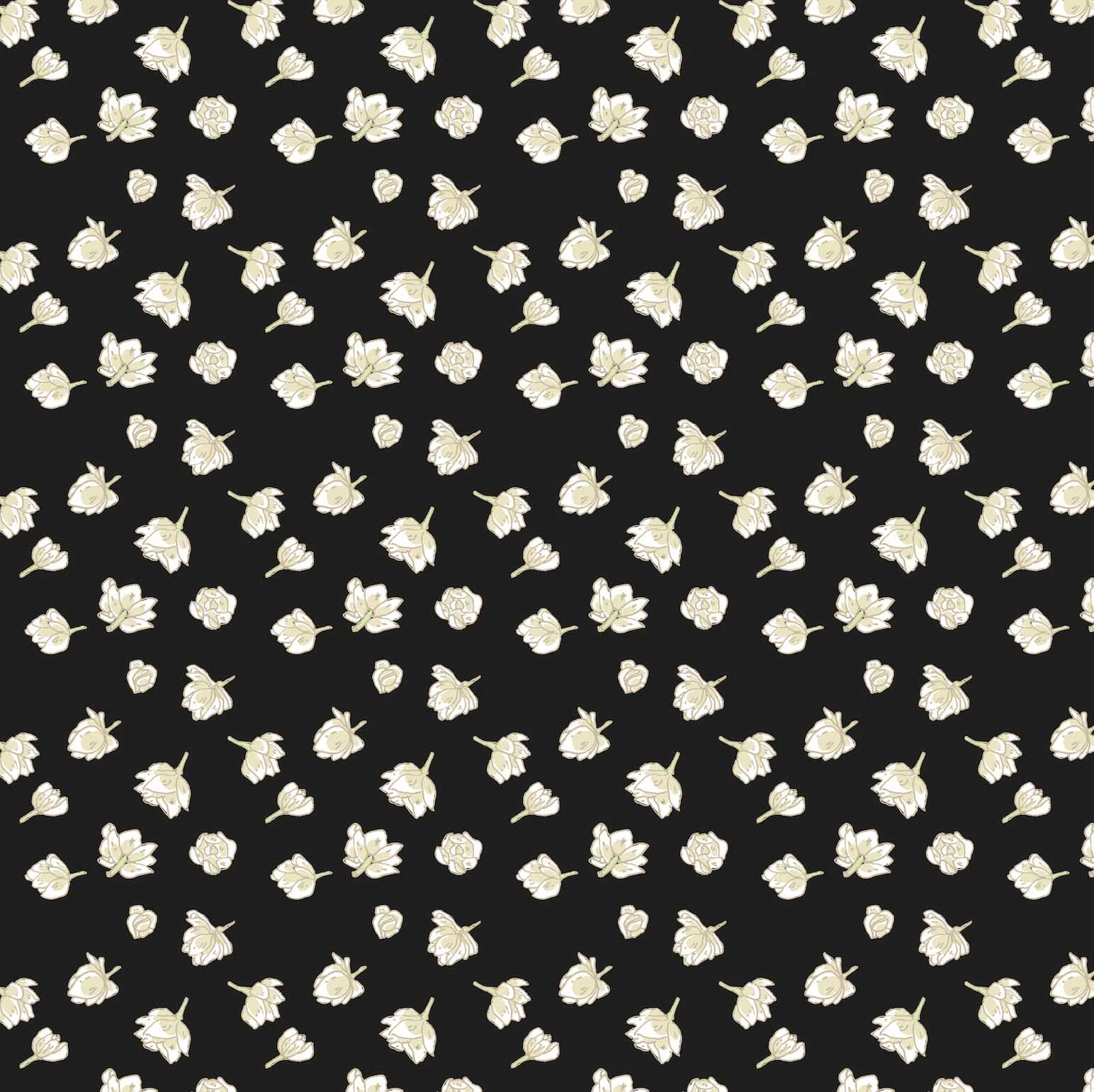
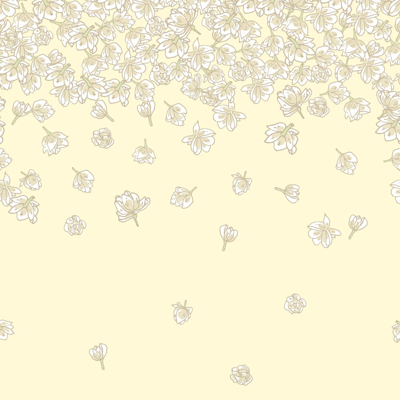
When building concepts for a summer collection, instinctively, flowers came into consideration. But we were determined to build prints that were original, that we could own- prints that weren't like florals you could buy just anywhere. And so we decided to challenge ourselves with form- working with Indian flowers, but rendering them in contemporary styles. For months, we experimented with marigolds, bougainvilleas and wildflowers, settling finally on the flower that evoked the most nostalgia in all of us with its unmistakable fragrance- The mogra, or jasmine.

Form, pattern and colour experiments with mogra flowers, leaves and buds.
The garments used in the images above were used as mocks in the early stages of design, and are representational only. These are are not part of the Rheson collection.
After a whole lot of experimenting, we worked with a colour palette of black, off-whites and yellows, covering tunics, kurtas, dresses and sarees with clusters of flowers and cascading buds


Rhea and Sonam in white and black Mogra Palazzo Sarees
Campaign Designed by The Brewhouse
Shot by R Burman
Styled by Deep Kailey

To know more about Rheson and the story behind the brand, watch the launch video here