


Hardcat
October - February 2024
Launched February 2024
Scope of Work
Identity Re-design
Design System {Colour, Typography, Iconography and Imagery}
Website Design
End-to-End Project Management
View Website
Overview
In October 2023, Hardcat, a leading asset management organisation based in Melbourne, Australia, approached me to build a distinct visual identity that could reflect the brand’s renewed strategy and focus on customer experience. The identity needed to represent the product offering—an innovative and accurate asset management software and shift perception towards that of a leading, credible, robust global brand. To that effect, the brand identity needed to cue confidence, expertise and reliability.
Why re-brand?
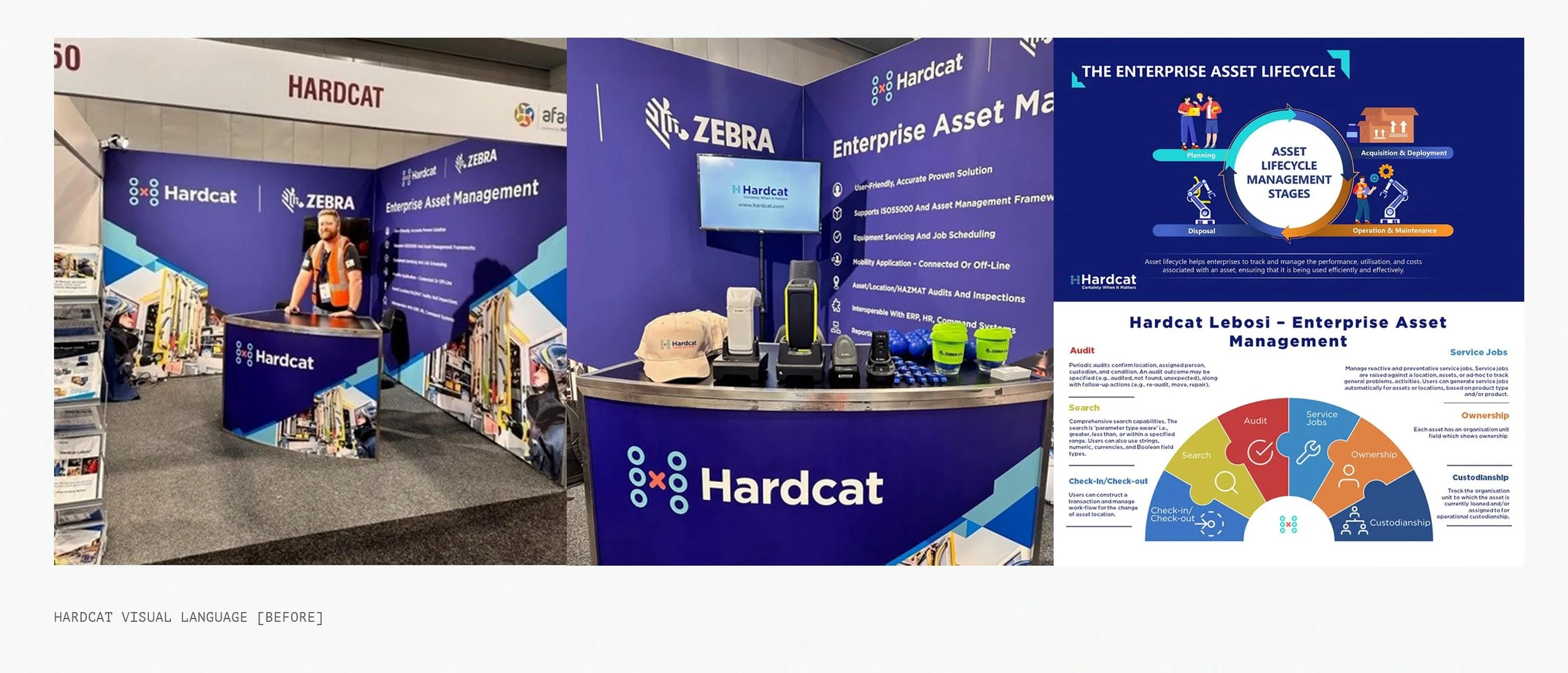
Hardcat has been a market leader in asset management for over thirty-five years, and when they approached me, had been working with a renewed strategy and needed a brand new identity to represent the Hardcat of today, and take it into the future.

The Identity
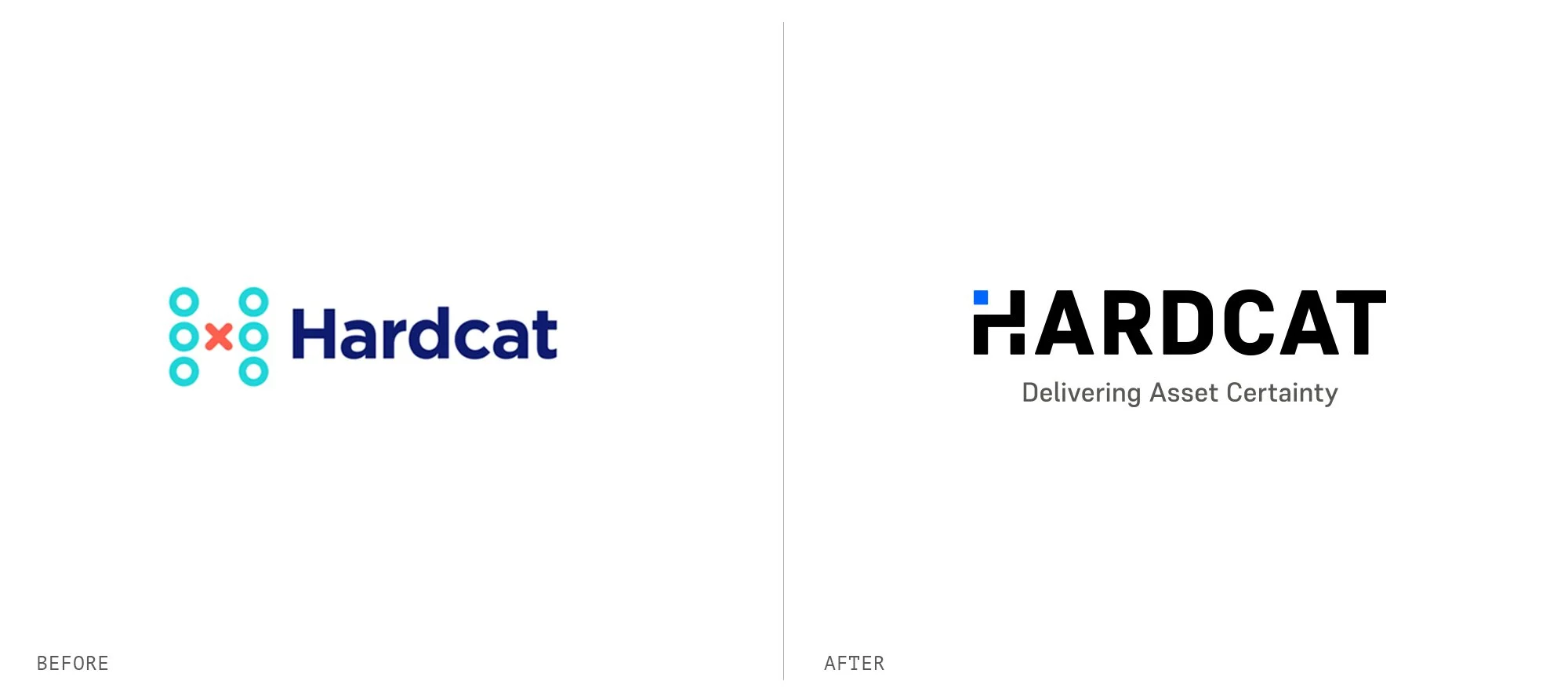
Our approach to design presents Hardcat as solid, strong and efficient, with the blue square representing the single source of truth, thereby positioning Hardcat as an asset in itself— one that helps organisations take informed decisions, manage risks and improve profitability.
The focal point of the wordmark, the letter H combines abstract forms of a trail and the blue square- the single source of truth; a promise of certainty. This also works independently as a symbol, with the form lending itself effortlessly to embossing, stamping or laser cutting. In full colour, it works well as a condensed logo— whether for social media profiles, a website favicon or a container form to crop images within. The colour palette includes a dark charcoal and a vibrant blue. The distinctive, bright blue indicates security and trust. In combination, the colours strongly cue confidence and strength, and hint at the tech industry.

The Design System
Colour, typography and photography come together to form a clutter-breaking design system that extended to every touch point from the very smallest to the largest. Through our design system, we were able to build consistency and cohesion for the brand across platforms and collateral, creating a brand language that was distinct and easy to recall.

Iconography
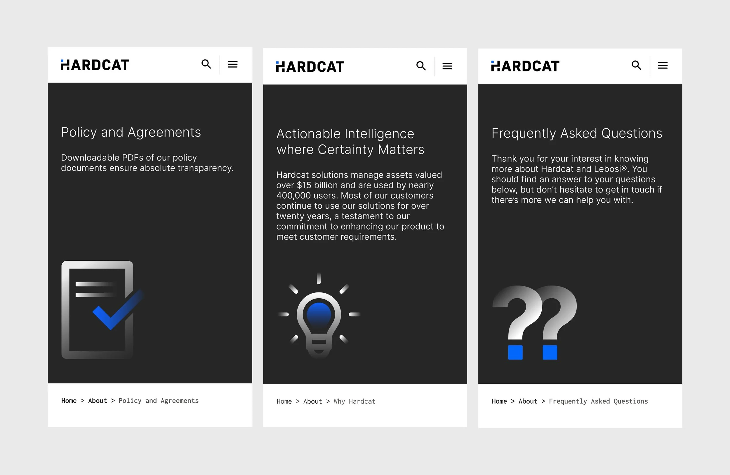
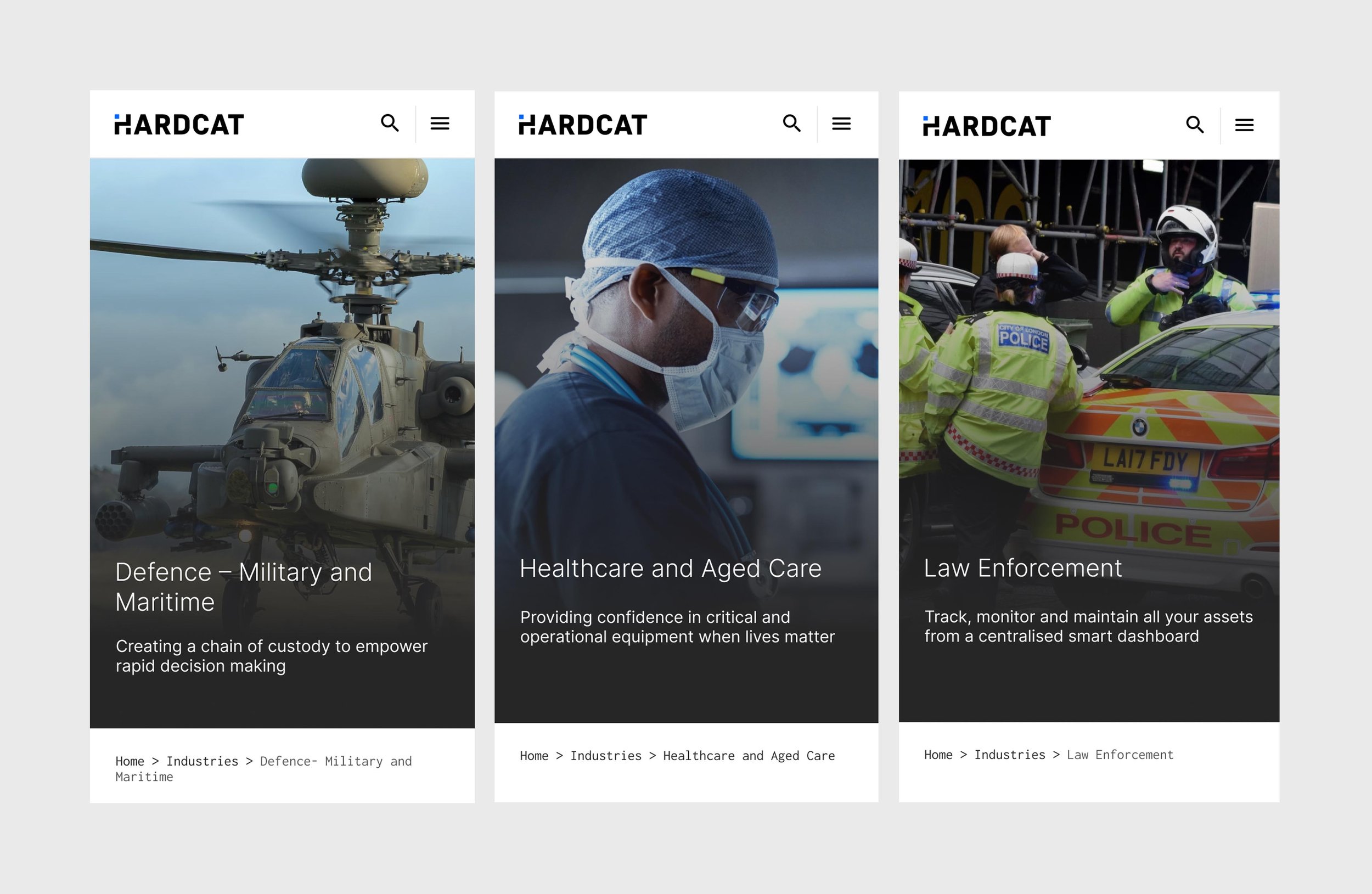
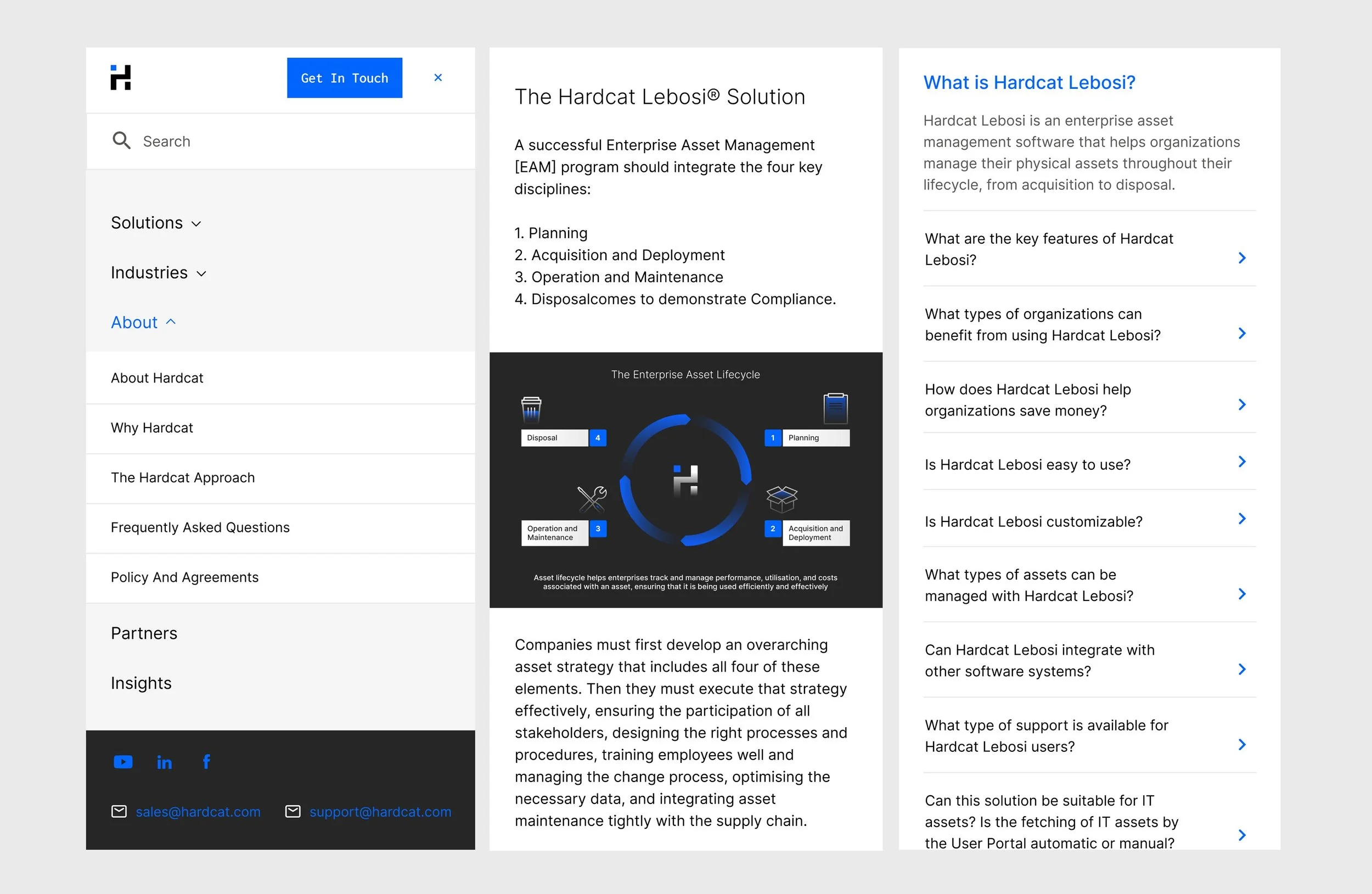
Along with colour and typography, iconography became a very important part of the brand’s visual language. With the various aspects of asset management being quite abstract, often, the best way to communicate nuances of the business was through icons, as opposed to meaningless images. We created an exhuaustive bank of icons for Hardcat, in two styles- a more illustrative style for website banners and presentations, and a simpler line drawing style for utilitarian icons. The icons were designed to work in single colour as well as two colour, on light and dark backgrounds.
The Hardcat Website
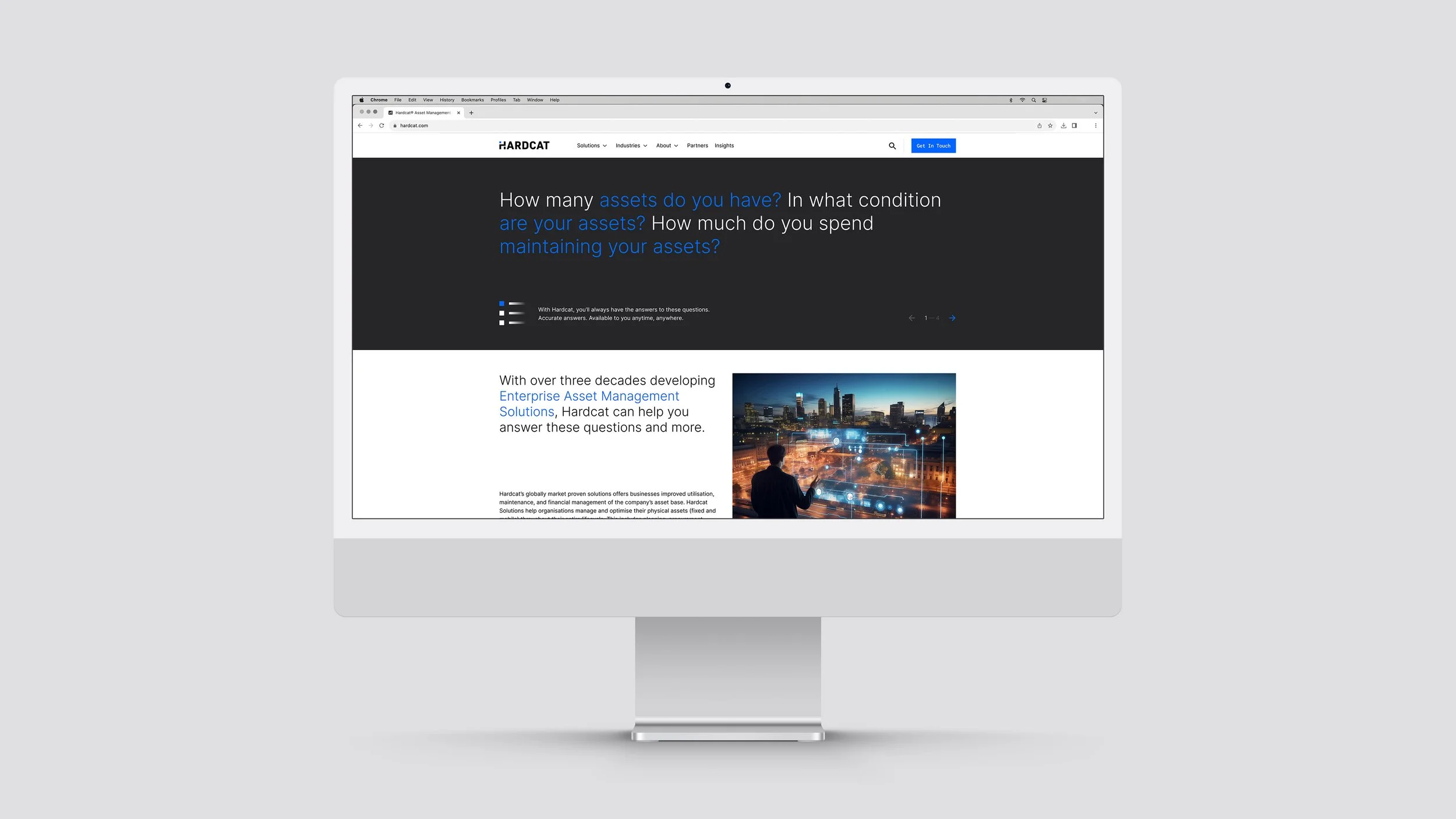
Fundamentally, the goal with the redesign of the Hardcat website, was to present the brand to potential customers and the world at large in a cohesive, structured manner that revealed the new identity, reflected the new brand strategy, and erased any misconceptions about the brand by briefly, clearly and articulately explaining what it is that Hardcat does and how it could be an asset to companies.
At a surface level, the goal was to:
Reveal the new Hardcat brand identity
With a modernised interface and better mobile presence, change the perception of the brand to a global leader
Use the rebrand as a signifier for the underlying strategic changes and shifts and evolution in the business
Redefine brand reputation through testimonials that cannot be missed
And at a deeper level, we aimed to:
Build Brand Awareness : reframe how Hardcat was perceived
Sharpen SEO : to state clearly and concisely who Hardcat is and what they do
Improve Content : to craft content for real people and do not overwhelm them with technicalities or volume of content
Improve Usability : use intelligent UX and UI to reveal information at the correct points and direct the user’s journey through the website
Convert site visitors into leads and leads into customers : to use the website as a sales machine
Our Approach
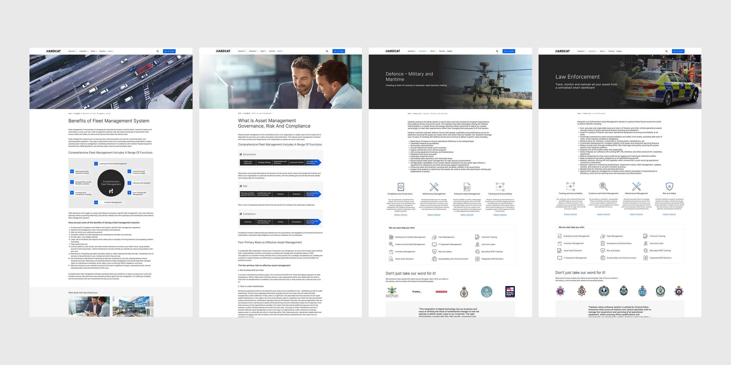
With clearly articulated goals, we spent a great deal of time building wireframes and prototyping continuously to ensure that the user experience for each kind of stakeholder was effortless and enjoyable. We created a navigation system with clear headings and a nested system that ensured users weren’t overwhelmed with an overload of information, but at the same time, could easily find anything specific they were looking for. It was equally important to ensure that the website was easy for the Hardcat team to manage, edit and add to, and so we took on the task of creating a system with easy-to-use templates that allowed for easy updates without being restrictive.
Once we had that in place, we shifted focus to the user interface. Building on the Hardcat visual language, we added typography styles that would convey the authority and credibility we wanted to communicate, built a clear system for the treatment of photographs with a signature gradient overlay, and built our extensive library of icons.

The responsiveness of the website was always priority, and so mobile screens were designed in parallel. No detail was too small while building screens, and we ensured that every single component responded beautifully to make for an enjoyable, easy reading experience.
Impact
Re-branding a thirty-five year old company is never easy. There are always emotions at play, and the process needs to be managed with care, respect and sensitivity. Ultimately, a large part of the success of a re-brand is when founders, employees, clients and well wishers respond to it with positivity and excitement. This was, undoubtably, the case with Hardcat, which made the design process incredibly gratifying.
Over the course of the five-month long re-branding exercise, we equipped the Hardcat team with assets to ensure that deploying the new branding across collateral was simple and enjoyable. The toolkit we handed over to the Hardcat team will stand them in good stead for years to come, leaving them with the cohesion, consistency and high-quality brand design they wanted.

The Team
Concept, Design and Project Management
Anya Rangaswami