

MSVgo
Commissioned by Hurix Digital
October 2020 - March 2021
Launched June 2021
Scope of Work
Brand Design Audit
Identity Design
App Design Review and Audit
Mobile App User Experience Design
Mobile App User Interface Design
Links
Available for download on Google Play and The App Store
Overview
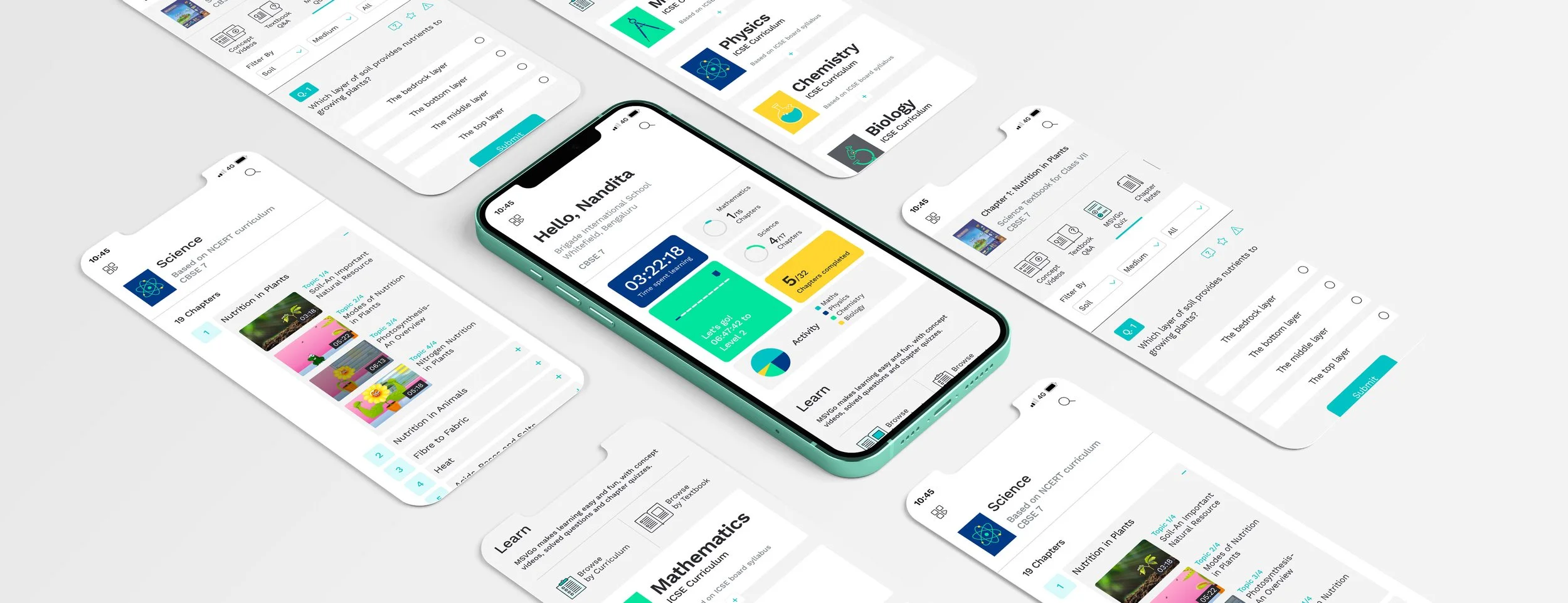
MSVGo is a digital learning aid that breaks down Maths and Science concepts into videos for effective learning. Covering a curriculum for students from grades 6 to 12, the high quality video content and range of topics covered, caused the app to gain a steady stream of loyal users. After the Covid19 pandemic saw students spend more time learning online, the app became the need of the hour, and it proved integral to take a closer look at the product, the user experience and the interface to bring it up to par with the competitive and rapidly growing EdTech market.

Part 1 : User Experience Design
What could we do to improve the product?
Two key aspects drove our design decisions. One, was a detailed design audit we conducted that revealed some imperfections and a few missed opportunities when it came to the experience of using the app. The second, was the new vision for the product which the founders wanted to build into this upgrade. Every decision we made needed to address the issues raised by the former, as well as effectively include the additions in the latter.
The design audit
We listed our key areas of focus, and worked on dozens of iterations, constantly building wireframes and prototypes to put our ideas to test.
Some of the issues the design audit revealed included:
The need to build a more engaging user experience, to keep both parents and students coming back for years.
The need to differentiate the app clearly, in order to be the go-to platform for students
The need for easy discovery, so the massive archive of content could be accessed and enjoyed
The need to create easy connections and guide a student’s learning path
The need to add more quizzes and quick revision exercises, so students could test their learning.
The need for a simpler on-boarding experience
The need for shorter, clearer instructions and a friendlier tone of voice.


Part 2 : User Interface Design
The design audit revealed areas of improvements that could be made, that I used as a guide when building the brand’s visual style. With users as young as 11 years old, the visual system seemed a bit heavy and sterile. The darker theme worked well while the app was predominantly video led, but proved cumbersome once more text was introduced. A more extensive, well resolved colour palette, a clearer typographic system, a less-industrial, more human iconography style and an overall brand-language that was consistent across the website, app and even certain title slides in the videos, would make the brand personality clearer and make the learning experience easier.


Design Decisions
Our design philosophy, was to give the app a sense of lightness, and to make learning easier and more enjoyable. I worked with a vibrant colour palette, with aqua used as the brand colour, and a supporting palette of greys, blues, greens and yellows. We worked with a typeface that prioritised legibility- a geometric, humane sans serif- Work Sans. I developed a family of icons exclusively for MSVgo, that were based on simple shapes, minimally illustrated, and in their active state used the brand colour, aqua. The result was an easy to navigate, fresh looking app that was received exceedingly well by users.


Part 3 : Identity Design
With the revised product experience in place, it became clear that the brand logo could use as update as well. For several reasons, the previous logo didn’t quite fit with the new product; not in terms of the visual style, but what the logo represented.
The identity focused on video content, with the letter ‘V’ in a triangular play button. With all the improvements made to platform, MSVgo was now about so much more than just videos.
Second, the word ‘go’ was used an element external to MSV, that in certain reproductions appeared small or easy to miss.
The line ‘Math Science Videos’ no longer entirely described the product offering.

And so, we moved away from the previous identity, to a younger, fresher version, addressing each of the problems identified. While we retained the essence of the identity, we used the triangular play button to house the words ‘go’. The play button grew to become a wonderful device, distilling learning to something that simple- press and play. We moved from uppercase to lowercase letterforms to create a more balanced word mark, and tied in the triangular play mnemonic to the logo. This formed the head of an arrow and ensured that the word “go” could not be missed. Our logo unit was flexible, designed to adapt to different applications as the brand made itself known.

Part 4 : Impact
The updated MSVgo app has been a success, crossing over 1000000+ downloads on the Google Play Store, and with a 4.5 star rating on Apple’s App Store. These are some of the reviews from Google’s Play Store immediately after the app update was made available. There was a perceived improvement in the user experience, making learning easier and more engaging.
